Making a space more practical, facilitating daily tasks, creating unity in interior design, providing different possibilities for an area without modifying it, and adding beauty are not easy tasks. Still, some elements are essential for achieving them: cabinets and shelves.
Previously, we presented some examples of these furnishings that provide versatility and integration with architecture. Here, we delve into some projects that adopt these and other characteristics to bring even more functionality to each environment and highlight why each design is special.

In Spain, BEAR had to respond to the challenge of collectors who wanted to bring their objects as an extension of architecture. The (Dis) Order Residence was structured around two large bookshelves that bend and stand out from the geometric guidelines given by the perimeter of the construction, introducing a certain alteration or disorder that invites you to pass through them, turn them around, and enter the elements they contain. Hidden inside are the bathrooms and the closet gym, and outside, there is an exhibition of records and mobile DJ equipment. Thus, joinery takes continuous prominence in the house, accompanying and modifying the environment as it adapts in position and size according to the use it serves.


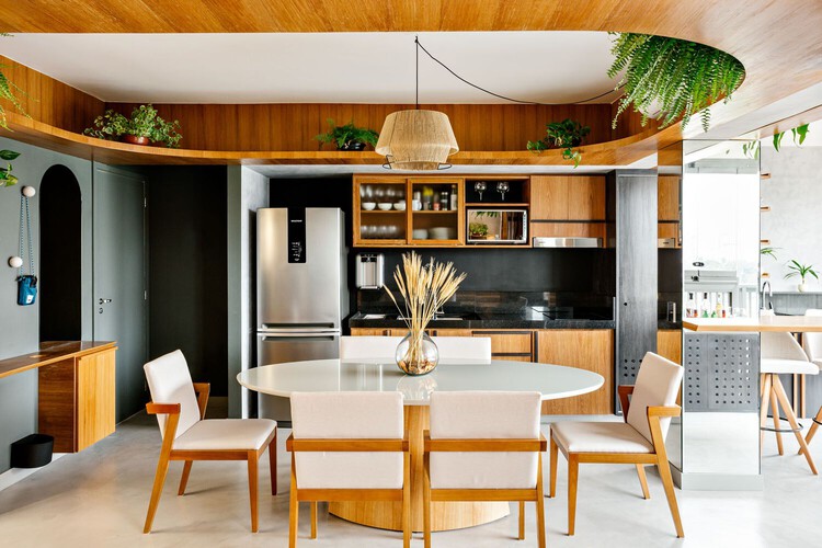
In the DB Apartment, designed by Studio Papaya in São Paulo, joinery in Cumaru wood and details in Black Wood veneer generate a visual hierarchy. These details contrast with the other colors and textures chosen for the interior design project. The replacement of the existing ceiling with a wooden cornice is a striking element in the central area of the apartment that brings different decorating possibilities and minimizes air conditioning needs.


In search of increased natural ventilation and lighting, the Home Studio workstations were symmetrically positioned near the window, valuing the framing of the Brasília landscape. To fulfill the two main functions of the place, work, and leisure, Studio Clarice Semerene subtly divided the area through a perforated metal bookshelf, filled with books, objects, and plants, which, in addition to bringing a material contrast, helps bring nature and well-being into the interiors, without blocking natural light.


To attract Chinese passers-by, elements randomly move between wooden components and project a poetic scene of dispersed light and shadows on the ARC'TERYX Store windows and walls. For this effect, STILL YOUNG designed mobile cabinets that allow spatial adjustments and create changeable scenes. These elements are composed of acrylic partitions that refract light, producing a soft effect. They also contain industrial metallic texture hangers that help create balance with the rest of the environment.


Desiring to always have objects on hand, niches, shelves, and pegboard panels were designed for the Consolação Apartment. Marê Arquitetura says the joinery material also reflects the project's concept: little fuss, simplicity, and refinement. To meet this expectation, raw plywood was chosen for its neutrality, rustic and natural aspect.

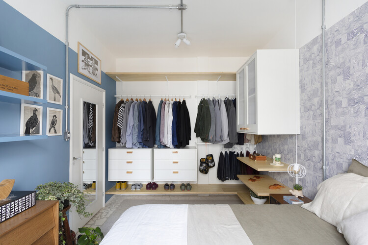
In the same apartment, as in the closet of the Paleta Apartment, designed by com/c arquitetura, the bedroom closet is marked by the simplicity of making some elements exposed and others protected, facilitating the organization of clothes, as well as making them elements that help configure the environment composition.


Finally, we bring two São Paulo examples that add different functions to the same design: in the Praça da República Apartment, the Sabiá Arquitetos and Pianca Arquitetura offices created a library - with a reading nook and a ladder that facilitates access to books - positioned on the highest wall of the environment, making it a standout element. In the Neko Apartment, joinery connects the kitchen, dining room, living room, and entrance hall. Additionally, the architecture team composed of Vic Calil Arquitetura + Douglas Angeoletto + Isabela Vieitez Arquitetura had to incorporate playful elements for the three cats in the family.


